| Thursday, July 26, 2007 |
| Easy on the Eyes: A Quick Case Study |
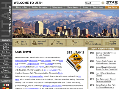
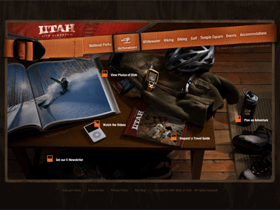
A great illustration here of the difference between average design and the kind of design that made me want to become a designer (and i didn't design either of them).
Just a quick point. Utah.com used to be a pretty decent website, design speaking. About a year ago, when Utah introduced their new "Life Elevated" campaign, Utah.com did a site redesign. Actually, I think of it more as a de-design. They messed it up. Really-see above. You'll have to trust me that the old one was a bit better.
On the other hand, i came across Utah.travel tonight. Which would you rather explore? And when it all comes down to it, if tourism is doing it's job--shouldn't it make you want to explore?
Well, every good story needs a sad ending (like the end of Harry Potter and the Deathly Hallows when Harry...nevermind. I don't want to spoil it for you).
So here's the catch: Utah.travel, at this point, is basically an elaborate landing page to Utah.com. Most of the navigation on .travel takes you to pages on .com leaving the user feeling a little ripped off. To ease the pain, click on "View pictures of Utah" or "Watch the Videos" and rest easy in the hopes that eventually the whole site will be converted to the new design.
Or just visit Colorado instead.
That was a joke. In the late 1840's, Utah actually fought Colorado. And Utah won (obviously). |
posted by Brett Crockett @ 10:30 PM   |
|
|
|
|
|